Multiple Mes Day 6: Lighting with Filters, Dodge, and Burn

Today’s essential question: How can I use filters and the dodge and burn tools to match the lighting throughout my Photopea collage?

By this point, you should have started combining your images in Photopea to create a scene. The lighting likely differs throughout, making it obvious that the scene was created from several different images. Today we will learn how to create the illusion of cohesive lighting through filters and the dodge and burn tools.

Adjusting Color with Photo Filters

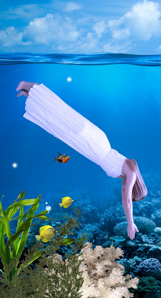
For an image to look cohesive, the lighting needs to be consistent throughout. The image below was clearly Photoshopped because Mckenzie is not as blue as the background:
blue_woods_no_filter

We can change that by using Photo filters.

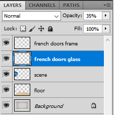
  1. First, select the layer with Mckenzie on it in the layers palette on the bottom right hand side of the screen. At the top of the screen, go to Image -> Adjustments -> Photo Filter
    image_adjustments_photo_filter
  2. We can click on the colored box to change the color of the filter, and preview the intensity of the filter by adjusting the slider. For this particular image, a turquoise filter at 40% seems to create the most realistic effect:

blue_woods_filter

Now let’s see if we can create a similarly realistic effect with a warmer background. Once again, notice how the original photo looks awkward when first placed in the scene:
orange_fire_no_filters

  1. Once again, we will select the layer with Mckenzie on it in the layers palette on the bottom right hand side of the screen. At the top of the screen, go to Image -> Adjustments -> Photo Filter. This time, an orange filter at 60% seems to create the most realistic effect:

orange_fire_filters

Establishing a Clear Light Source with the Dodge and Burn Tools

Photo filters match the colors of each piece of the photo collage, but for a truly unified image, we will need to establish a clear light source. This is where the dodge and burn tools come in. They will allow us to add highlights (dodge tool dodge_tool ) and shadows (burn tool burn_tool ) in a similar manner to traditional drawing.

In the image with Mckenzie, the fire is a natural light source. Therefore, we will want to darken the left side of Mckenzie, the bottom portion of Mckenzie, the ground area around Mckenzie and the fire, and the bottom portion of the logs.

  1. First, we will click and hold on the dodge tool dodge_tool from the tool bar on the left side of the screen.
    The burn tool burn_tool should appear in a drop down menu below it.
  2. Next we will adjust the settings at the top of the screen. It works best if you set the exposure of the burn tool low, and darken your desired area slowly. This is how I have set my burn tool:
    burn_tool_settings
  3. Now select your desired layer in the layers palette on the lower right side of the screen. I always duplicate the layer (Layer -> duplicate layer) before dodging or burning it, so I can go back to the original layer if I mess up.
  4. Paint your desired area with the burn tool. You can adjust the size of the brush at the top of the screen, or by using the right and left brackets. Slowly shade the areas you want to darken just as you would with a pencil. You will have to select each layer in the layers palette on the lower right side of the screen before you can use the burn tool on any objects in that layer. Notice how we have now created a clear light source by painting shadows with the burn tool:
    orange_fire_filters_burn_tool
  5. If you would like to highlight any parts of the image, click and hold on the burn tool in the tool bar on the left side of the screen. The dodge tool dodge_tool should appear in a drop down menu below it. Select the dodge tool, adjust the setting at the top of the screen so the exposure is set to 15-25%, and paint as needed to create highlights.

Here is a side by side comparison of the original collage, as well as the collage after we have applied photo filters and the burn tool:

Be careful not to go overboard with the dodge and burn tools:
intense_burn_tool

Featured Artist: Tim Burton

Today’s essential question: How do artists and directors use green screens to create digital special effects?

Today we will look at how director Tim Burton utilized green screen technology for his 2010 production of Alice In Wonderland. We will then finish our project proposals.

What are some connections between Tim Burton’s work and our Multiple Mes Project?

Here are some stills from Alice in Wonderland:

And here are some images depicting what was actually filmed in front of a green screen:

What surprises you? What ideas have these behind-the-scenes images given you for your own project?

Want to learn more? This article covers Tim Burton’s utilization of a green screen and other special effects.

Combining images to build a unique setting

Today’s essential question: How can I combine images to build a unique setting for my story?

Creating a setting

You must photoshop at least 5 different images together for your background or setting.  (So, for example, you cannot just put the images you photographed in front of the green screen into an existing photograph – you must add at least 4, preferably more, other items to customize your scene.) The emptier the scene you start with, the better. For example, the image below is terrible for the purposes of the project, because it is already full of cars and people, so we have no room to add our own:

1f2d7a02-dd5c-45e9-84fe-b98e76377bf1

The next image is much better, because it has space to add whatever cars or people we would like, giving us complete control over the mood we establish:

dennys_restaurant_at_the_elko_junction_shopping_center_in_elko_nevada_cropped.jpg

Here is another example. These wooded scenes are all a great place to start because they have ample space in the foreground to add other imagery:

Here are some extra images that might make the scene more interesting:

Common Multiple Mes Photography Mistakes

Today’s essential question: What are some common issues that arise when taking photos for the multiple mes project? How can we prevent them?

Common Multiple Mes Photography Mistakes

Camera angles do not match
camera_angle

Why it happens: Different photos are taken from different camera angles. These photos then will not work together if composited into the same image in Photopea.

How to prevent it: Make sure you take all of your photos from the same height and camera angle, and make sure the angle of the camera matches the angle of your background scene.

Motion Blur
motion_blur

Why it happens: The subject moves before the camera finishes taking the photo.

How to prevent it: Use a quick shutter speed (if you have a DSLR). If you can’t control the shutter speed manually, force the camera to use a quick shutter speed by providing sufficient light and using a tripod to steady the camera. If you don’t have a tripod, you can steady your camera on a table with a pile of textbooks. Remind your model to remain as still as possible.

Subject is not Realistically Posed
zombiefilming2

darla-cropped.png

Why it happens: The model awkwardly acts out a pose without the necessary props, and consequently, poses themselves incorrectly. When the scene and props are later added in Photopea, they do not fit or look strange.

How to prevent it: Provide the model with placeholder props and scenery that mimic the size and shape of whatever will be added in Photopea. It’s amazing how much simple objects such as boxes, paper towel rolls, rope, and stuffed animals can help the model pose properly.

Bonus Tip: Place Green Screen (or a blanket or sheet in a contrasting color) on Ground to Easily Capture Action Shots
green_screen_on_ground.jpg

New Project: Multiple Mes

Essential Question:  How can I tell a story with a digital collage in Photopea?

Today we will introduce our next project, a Multiple Mes Photoshop Collage. We will photograph ourselves or a friend or family member, and then build a scene in Photopea that tells a story using these photos. You will create your own background by combining images you have taken yourself with images you have found online.

Here are some examples of past student work:

Project Requirements:

  • Created in Photopea or Photoshop
  • Original, realistic scene created from a minimum of ten images
    • Minimum of 3 clones photographed by you or a friend/family member. This should either be you or people you know in real life. Do not use images you found on Google.
    • Background created from a variety of images taken by student or downloaded from the internet. Any internet images must be noticeably modified to create your own unique scene.
    • Realistic background, middle ground, and foreground created through use of Photopea layers
    • No copyrighted characters
  • High Quality Craftsmanship
    • No pixelation
    • Background cleanly removed
    • Images Photographed from appropriate angles
    • Lighting matches up
    • Scale and proportion makes sense

New Project: Hero Collage

Today’s essential question: How can I use Photopea to create a digital collage honoring someone I consider a hero or role model?

Today we will start our next project. We will create a digital collage honoring someone that we consider a role model or hero. It can be a famous person or someone you know in real life. You will brainstorm a list of characteristics that you admire about this person, and then download images of plants that symbolize those characteristics. 

Featured Artist: Broobs

Self-Portrait

Broobs Marquez is a digital collage artist. His work is heavily influenced by botanical elements and nature. He strives to meld the past and present through his use of color, shape and subject matter. Marquez exhibits an interest in bringing visibility to queer artists and queer activists and uses his following to educate and illuminate champions of the queer community. Many of his artworks feature individuals who have been marginalized, and in some cases, killed, because of their activism for the LGBT, black, and Latinx communities.


In an interview with Adolescent’s online publication, Broobs talks about why he chooses to work this way:

“It’s really hard work, I’ll be honest. It’s all very emotionally charged. It comes from a place of me wanting to understand why these things even happen—trying to process all these deaths, and trying to understand what death even is. 

In a lot of ways, it’s to combat what I know the media is going to do in the long run, which is vilify them for existing in this world. Whether it be owning a gun, or having traces of marijuana in their system, or some other kind of drug. It’s what they always do with people who suffer police brutality. They always try to vilify them, and try to—in a lot of ways—make it okay that they were killed, by making them out to be quote-unquote ‘bad people.’ 

I feel like that’s what my work does as well. It shines light on them, and almost doesn’t make you question that their life was holy, or valuable. It just makes you see them in that light. “

Project Requirements:

  • Created in Photopea/Photoshop from at least 20 images (at least 5 different images that can be repeated)
  • Includes a photo of someone you consider a hero
  • Includes objects that symbolize characteristics that you admire about this person
  • Objects photos have been altered using filters to create a cohesive style
  • Good craftsmanship – backgrounds have been neatly removed, objects are not pixelated or distorted

Creating Unity

Today’s essential question: How can I create unity throughout my room?

Unity is when the different parts of an artwork go together to create a cohesive feel. It happens when you repeat similar objects throughout the piece. In interior design, this means using objects of a similar style, texture, form, or color.

Here are some examples of student work from this class that show unity:

1 Pt Perspective & the Vanishing Point

Today’s essential question: How can I use the vanishing point and orthogonal lines to help create realistic perspective in my room design?

One Point Perspective, Orthogonal Lines, and the Vanishing Point

We are using something called One Point Perspective to make our rooms look realistic. In one point perspective, everything appears to converge at a point in the distance known as a vanishing point. The objects in a one point perspective drawing utilize orthogonal lines (shown in blue) that converge at the vanishing point:

When a one point perspective image appears off, it is usually because the orthogonal lines are not properly converging at the vanishing point, like the example below:

See how this second example looks more realistic because the objects are properly converging at the vanishing point?

Advanced Technique: Furniture Surgery

If you are having trouble getting an object to look like it is realistically in the room, you may need to either perform surgery on the object (like my example below) or find a photo taken from a different angle.

This couch does not look like it belongs in this room, regardless of how I transform it using the scale, perspective, and distort tools. This is because I can either get the orthogonal lines to line up with the vanishing point OR I can get the bottom of the arm rest to be flat with the floor, but I can’t get both to happen, which is what we need for the couch to fit realistically:

After getting the orthogonal lines to converge at the vanishing point, I duplicated the couch and hid the original couch layer. On my duplicate couch layer, I erased everything but the arm rest. I then used the distort feature to make the bottom of the arm rest line up with the floor:

Now when I make the original couch layer visible, it looks like the couch actually fits in the room:

Thank you Photoshop magic!

Interior Design Day 3: Adding Scenic Windows

Today’s essential question: How can I add windows with a view to my room design?

Today we will learn how to add windows (and any scene we desire behind those windows) to our room.

How to Add Scenic Windows to a Room

  1. Open your window image and drag it into your room file:
    window_no_perspective
  2. Adjust the perspective of the window with the scale and distort tools (Edit -> Transform -> Scale, and Edit -> Transform -> Distort)
    window_perspective
  3. Duplicate the Layer (Layer -> Duplicate Layer). Hide the lower duplicated layer by clicking on the eye in the layer palette.
    layers_palette1
  4. Remove the inside of the window with the tool of your choice:
    window_inside_removed
  5. Open the scene you would like to go in your window.
    Drag the scenic image into your room file.
    Make sure the scene layer is below the windows layer in your layers palette:
    scene_no_perspective
  6. Adjust the perspective of the scene so it matches the perspective of the window with the scale and distort tools
    (Edit -> Transform -> Scale, and Edit -> Transform -> Distort)
    Remove any part of the scenic image that does not belong in the window with the Photoshop tool of your choice:
    scene_perspective
  7. Make the lower window layer visible in the layers palette and select it so it turns blue:
    final_layers_palette
  8. Adjust the opacity so the glass looks see through:
    windows_with_glass

This technique also works for doorways, closets, trophy cases, etc:

serena_room_small

Today we will:

  • Continue working on our rooms
  • Save our room files as both a Photoshop (.PSD) file and PNG
  • Upload both the .PSD and .PNG files to our shared Google Drive folders
  • Upload a PNG of our progress to the Google Classroom Assignment

Interior Design Day 3: Adjusting Perspective to Add Texture to Floors and Walls

Today’s essential question: How can I use various features in the transform tool (perspective, distort, scale) to add detail to my floor and walls?

Today we will download the blank room source file from Google Classroom and begin building our rooms in Photopea.

How to Add a Texture to Your Floor Using the Perspective Tool

  1. Open your “Empty_Room_Source_File” in Photopea.
  2. Add the floor. File -> Open & Place. Then upload the floor texture of your choice.
    hardwood_floor1
  3. Edit-> Transform -> Scale. Scale your floor so it fills the space below where the floor meets the wall. (This is one time that it is ok not to hold down shift, because distorting the dimensions of the floor texture in this step might actually make it look more realistic later.)
    hardwood_floor2
  4. Edit -> Transform -> Perspective.
    Drag the front corners of the floor outward to transform your floor so it has the correct dimensions.
    hardwood_floor3
  5. If your floor still feels a bit off, you can adjust individual points by going to Edit -> Transform -> Distort.

How to Add a Texture to Your Walls Using the Perspective Tool

You can use these same tools to add texture to the wall.

  1. Drag your wall texture image into the room file and use the perspective, transform, and distort tools to make it look like it fits on the wall:
    bricks1
  2. Once the first wall looks correct, you can duplicate the layer (Layer->Duplicate Layer), and flip it (Edit -> Transform -> Flip Horizontal) and then move it to the other side of the room.
    bricks2
  3. Duplicating layers will also help you fill the back wall. For example, simply scaling the image on the back wall may look strange if you force the bricks to fit the space.
    distorted_bricks
  4. However, you can scale the image to be the appropriate height (Edit -> Transform -> Scale).
    Once again, it may be ok to distort the dimensions of the image in this case.
    bricks3
    Then duplicate the layer (Layer -> Duplicate Layer).
    Flip the image so you will have a seamless tile (Edit -> Transform -> Flip Horizontal) and move the image so it connects with your other layer.
    bricks4
  5. At the bottom of your layers palette, click on the folder icon folder_icon to make a new folder.
    Name it “brick wall”.
    Drag all the brick layers into this folder. That will help keep your layers organized.
    brick_wall_layers

Further uses for the perspective/distort tools:

  • make a poster, framed picture, or mirror look like it is hanging on one of the side walls
  • add windows to one of the side walls

Today we will:

  • Begin dragging images into our room and using the perspective and distort tools to make them look like they realistically belong in the room.  Make sure you name your layers!
  • Save our image as PSD and  Export it as a PNG
  • Upload the PSD and PNGs to our shared Google Drive folders (THIS IS EXTREMELY IMPORTANT SO YOU DO NOT LOSE YOUR WORK!)
  • Upload the PNG to the Google Classroom assignment so Ms. Lawson can see your progress.