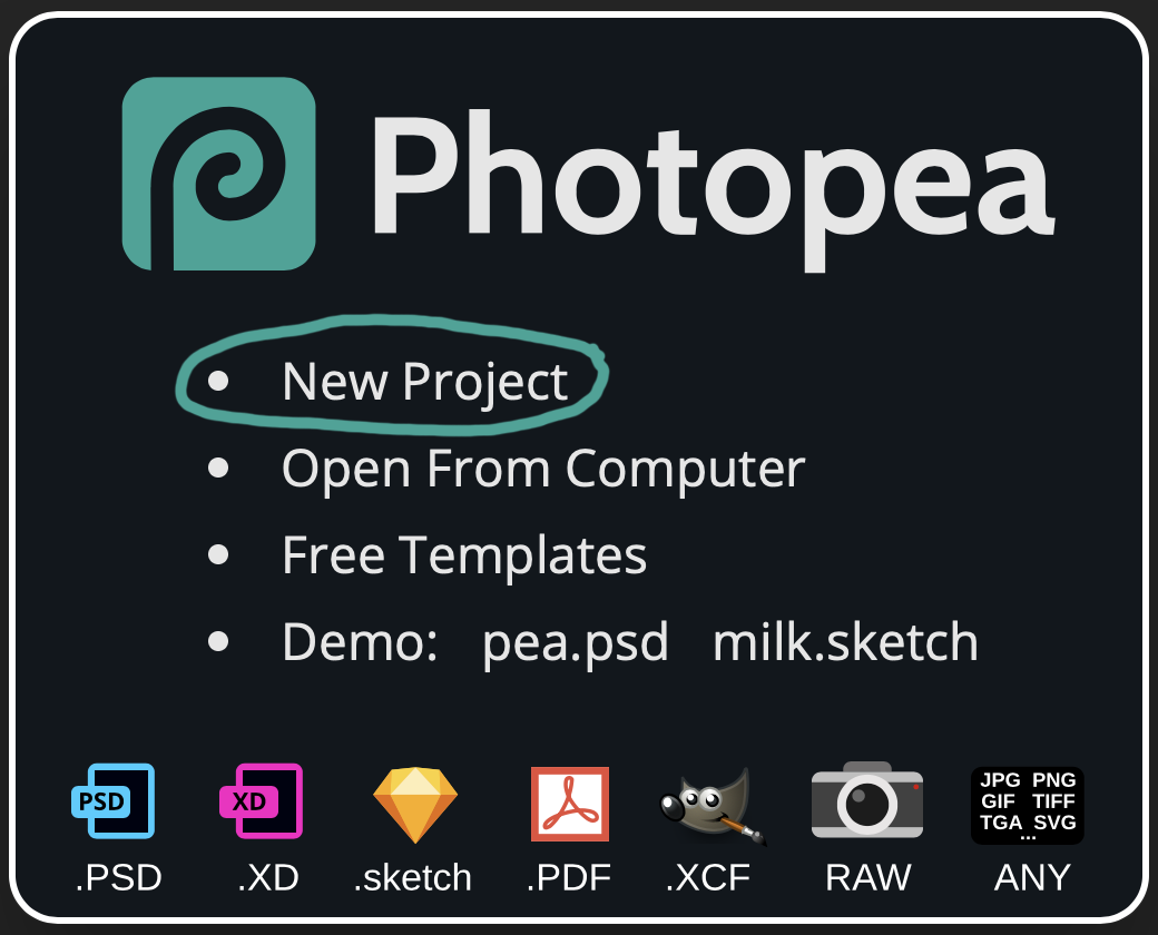
Today’s essential question:How can I use the Photopea app to create a digital collage?
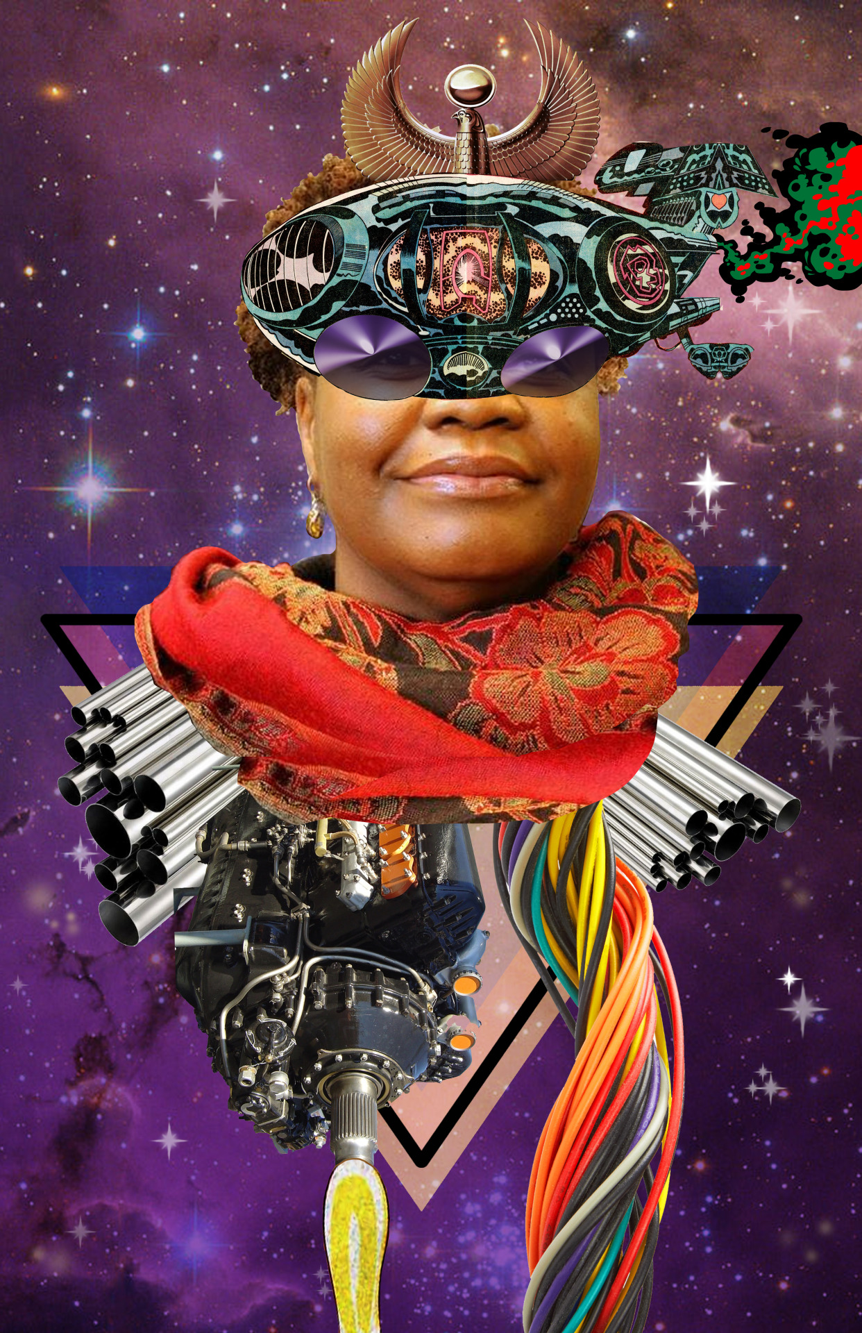
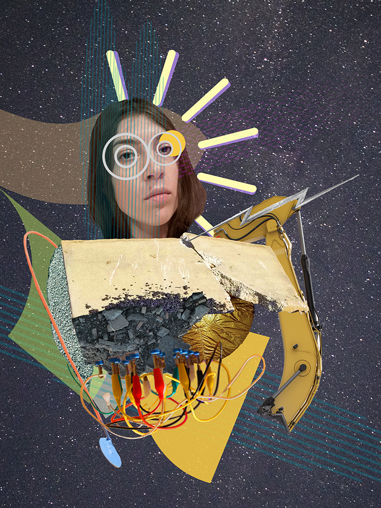
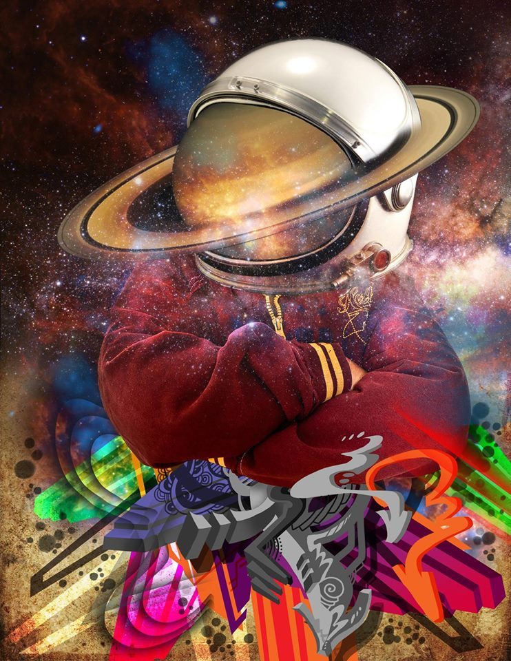
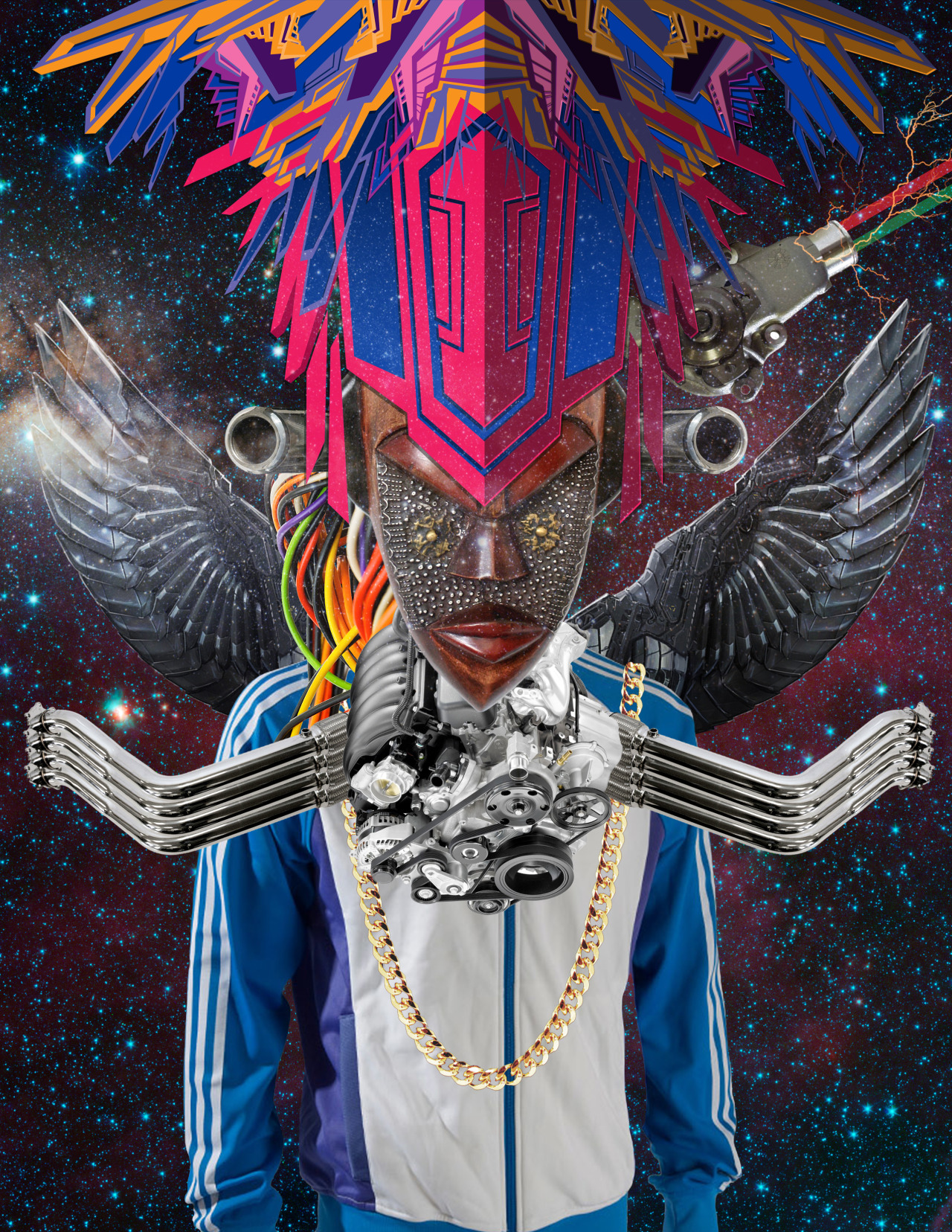
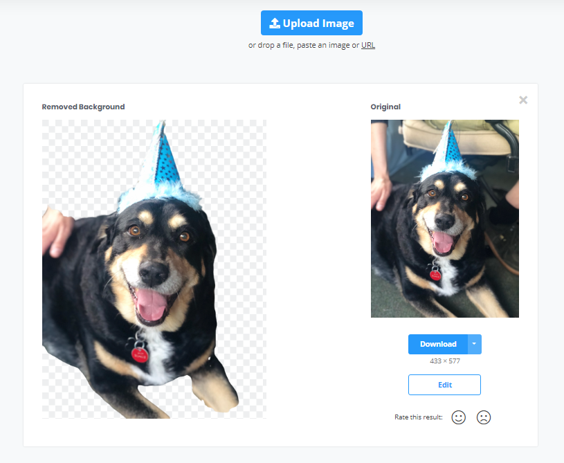
Today we will dress up an animal using the free app Photopea. We will combine a MINIMUM of 3 images – an animal of your choice and at least 2 accessories. If you are a fast worker, try to add more!
How to create a digital collage in Photopea
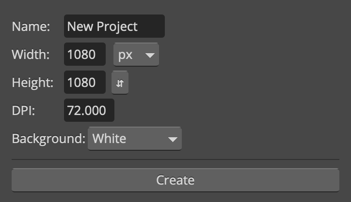
Go to Photopea.com. Click “Create New”
Create a new file. Set the dimensions to 1080 x 1080 px and then hit “create”.
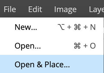
Import the first image you would like to use in your collage by selecting “File -> Open & Place
How to Move Objects
Use the move tool to drag objects around the canvas.
Make sure you are on the correct layer or you might accidentally move things you do not want to move! (The layer you are on will be a darker shade of gray than the other layers in the layers palette on the lower right side of the screen.)
How to Make Objects Smaller or Rotate them
Go to Edit-> Free Transform to scale and rotate objects as necessary Note: Do not make objects larger. This will cause them to pixelate and become blurry.
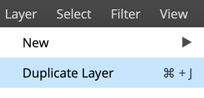
How to Duplicate Objects
To duplicate an image, Go to Layer-> Duplicate Layer:
How to save your images:
Click File -> Save as PSD (This will automatically save your image with layers to your downloads folder)
Today’s essential question:How can I use the Remove.bg app to easily remove backgrounds from the images I want to use in my digital collage?
Today will will use the Remove.bg app to remove the backgrounds from the objects we will place in our digital collage.
How to Remove the Background from an Image with the Remove.bg App
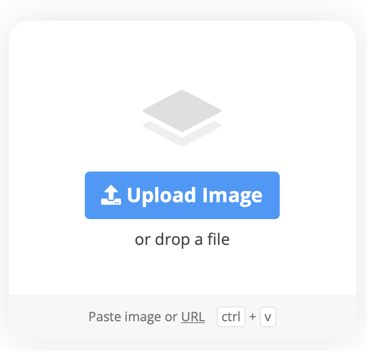
Save the image to your computer and go to Remove.bg.
Click Upload Image
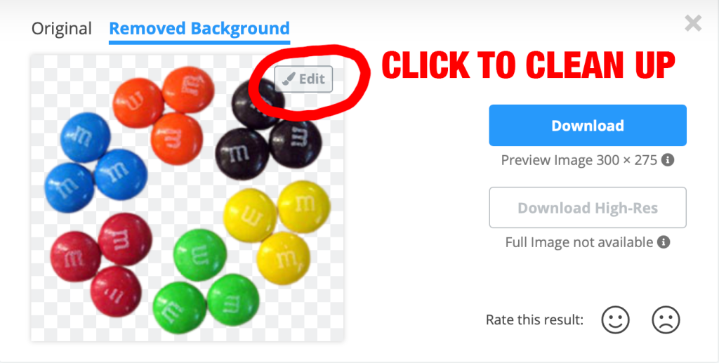
Poof – your background is gone:
You may need to do a bit of adjusting to remove parts of the background that were missed. If so, click the Edit button:
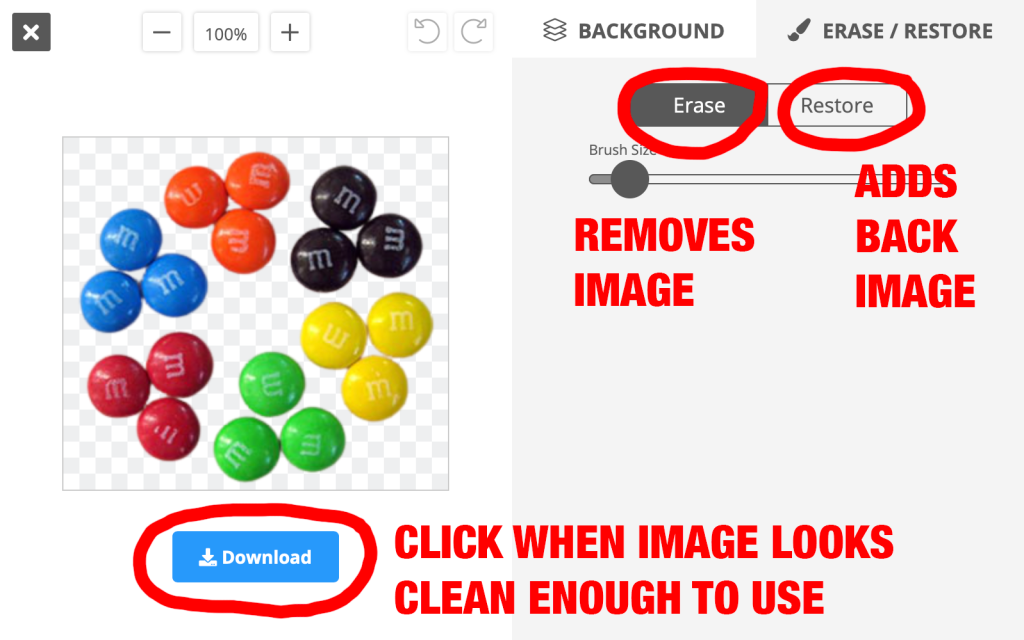
Sometimes the app leaves parts of the background behind, or accidentally erases parts of the image you wanted to keep. Once you are in “Edit,” you can use the “Erase” option to remove any remaining pieces of the background, and the “Restore” option to add back parts the image that were incorrectly removed. You can drag the slider to make the eraser/restore brush bigger or smaller:
Once you are happy with your image, click the “Download” button to save it to your computer.
Today’s essential question:How can I use background shapes, proximity, and alignment to group like objects together to make my design more scannable?
Proximity means that things that are related should be nearer to each other, and things that are unrelated should be placed further from each other.
Alignment is a design principle that refers lining up text or graphics on a page. A design with poor alignment will look cluttered and unfinished. But aligning elements on the page will organize your design and make it easier to read.
Designers often use background shapes to group like objects together. Notice the difference:
How have the student examples below utilized background shapes, proximity, and alignment to reduce visual clutter?
Click on any font you are interested in, type the name of your cereal into the preview box, and take a screenshot.
In Photopea, click File -> Open & Place
Scale the image until it is the size you want it to be. Make sure you hold down the Shift key and scale your text from the corner so it doesn’t distort!
Rasterize your layer (Layer -> Rasterize)
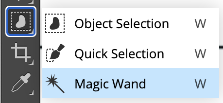
Click and hold on the Object Selection Tool until the Magic Wand pops up:
Select the Magic Wand
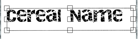
Click on one of the letters to select it. Hold down on the shift key and select the remaining letters.
Change the color (if desired) by double clicking on the Color Swatch at the bottom left screen.
Open the cereal box template file (it should be in your downloads folder):
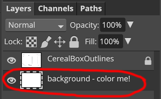
How to Change the Background Color
Select the “background – color me” layer in the layers palette on the lower right side of the screen
Double click on the color swatch on the lower left side of the screen. Adjust the color until you have selected the color that you would like your background to be.
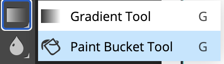
Click and hold on the gradient tool in the toolbar on the left side of the screen until the paint bucket pops up:
Select the paint bucket. Click anywhere on the cereal box template to paint the background.
How to Add Graphics
Go to File -> Open and Place and begin placing your graphics:
Continue using File -> Open and Place to insert your other images
Use the move tool to move images into their correct location
How to Make Objects Smaller or rotate them
Go to Edit-> Free Transform to scale and rotate objects as necessary Note: Do not make objects larger. This will cause them to pixelate and become blurry.
How to Duplicate Objects
To duplicate an image, Go to Layer-> Duplicate Layer:
How to save your images:
Click File -> Save as PSD (This will automatically save your image with layers to your downloads folder)
Today’s essential question:How can I use typography to create a professional looking cereal box?
Here are some tips on how to combine typefaces to achieve professional results:
Limit yourself to two fonts – one decorative and one plain/legible (easy to read).
The decorative font should be used for titles and headings, and the plain font should be used for the body/large areas of text.
As a general rule, you should use two different typefaces to keep things interesting yet unified. These typefaces should be fairly different to show contrast. Use the decorative/fun font for titles and headlines, and the more legible plain font for the body/large areas of text.
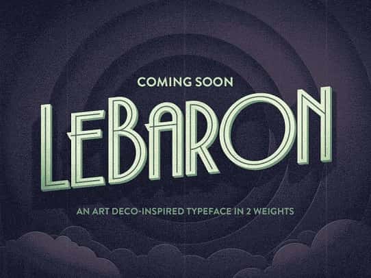
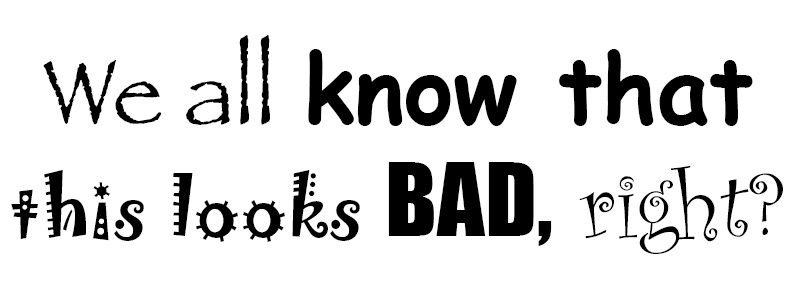
Too many fonts can distract and confuse your audience, like in the example below:
Using too many different “fun” fonts will make your project look like a hot mess
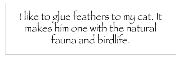
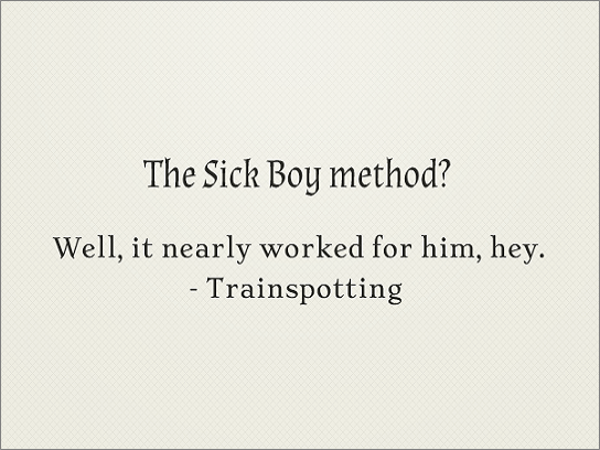
NEVER set body text in a decorative typeface – it will make it illegible and look unprofessional. The image below explains why::
Create Contrast
Using contrasting typefaces makes it clear which text are headings and subheads and which are body copy. The differences help create distinct roles for each font, allowing them to stand out as individual pieces of information. Remember to use the decorative/fun font for titles and headlines, and the more legible plain font for the body/large areas of text.
Avoid combining fonts that are too similar
Conflicts between fonts happen when the fonts look too similar. As you can see in the example above, the two fonts share the same weight, size and decoration. As a result they’ve become too alike. They’re performing very similar roles, but the small differences are conflicting which makes for an awkward overall effect. This makes it difficult to establish a hierarchy, because the fonts aren’t visually distinguishable from each other. In fact, font combinations that are too similar can often times look like a mistake—as if you’d been experimenting with different fonts and had forgotten to clean up after yourself.
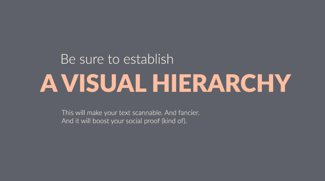
Establish visual hierarchy
Visual hierarchy tells people where to look first and what is most important. It can be achieved with size, weight, color, texture, orientation and space, or any combination of these tools. Generally, the viewer will first look at whatever is the largest, boldest, or brightest. Visual hierarchy is a great way to add visual interest to your design while limiting yourself to two typefaces.
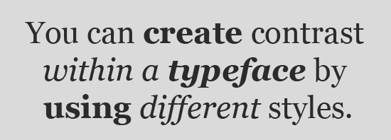
Use different weights of the same typeface
To pair fonts that come from the same family, plan carefully to create contrast, varying things like font size, weight (such as light, regular, and bold), and case (upper, lower, small caps). One of the benefits of limiting your fonts for a presentation to one font family is that it creates a more consistent look. This is another way to keep your design interesting while limiting yourself to two typefaces.
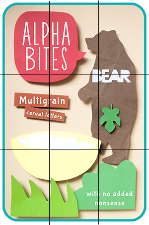
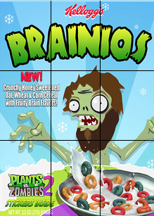
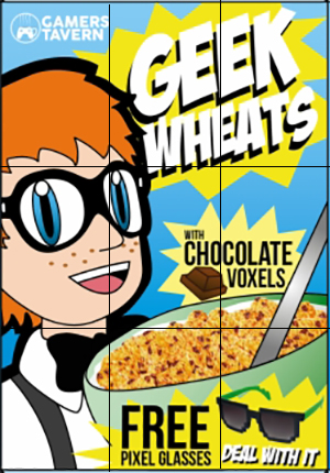
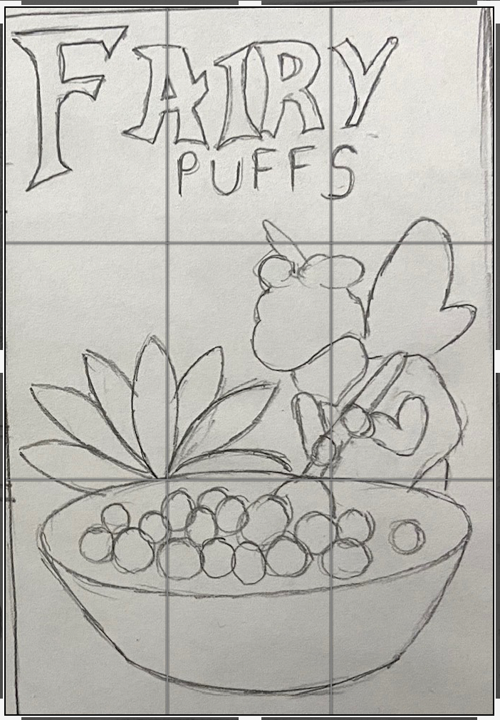
Today’s essential question:How can I use the rule of thirds and visual hierarchy to create a prominent focal point in my cereal box design?
Rule of Thirds
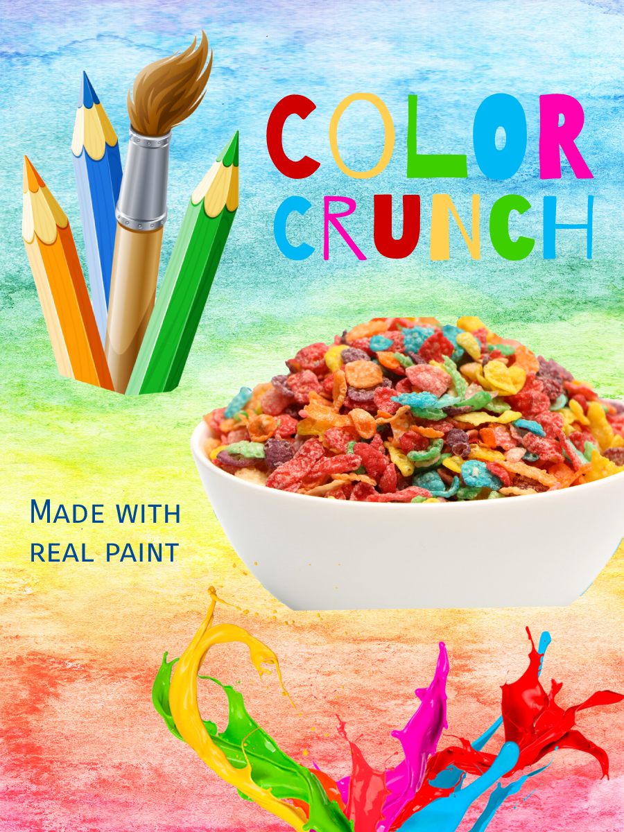
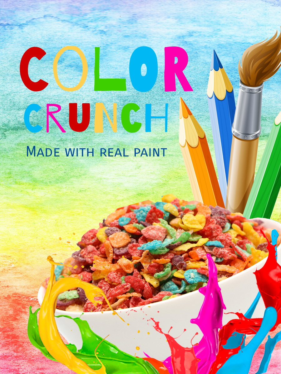
To apply the rule of thirds, break an image down into thirds (both horizontally and vertically) so that you have 9 parts. Place points of interest in the intersections or along the lines to create a more balanced and visually interesting composition. Studies have shown that people’s eyes usually go to one of the intersection points rather than the center of the design. When we use the rule of thirds, we make the way people naturally view images work for us rather than against us.
How have the cereal box designs below used the Rule of Thirds?
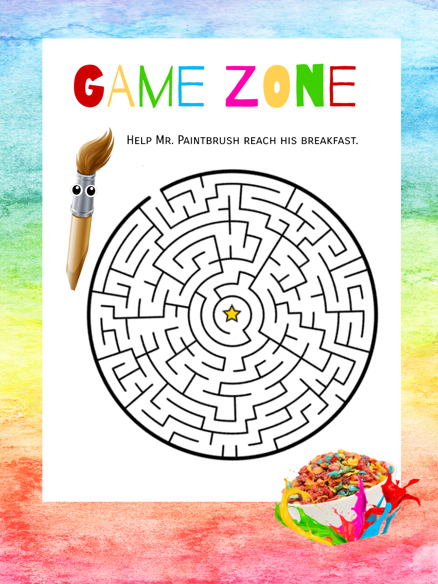
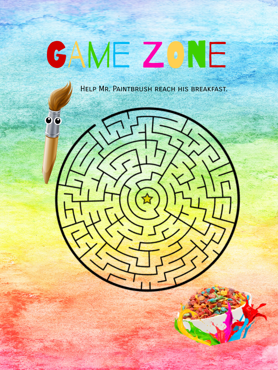
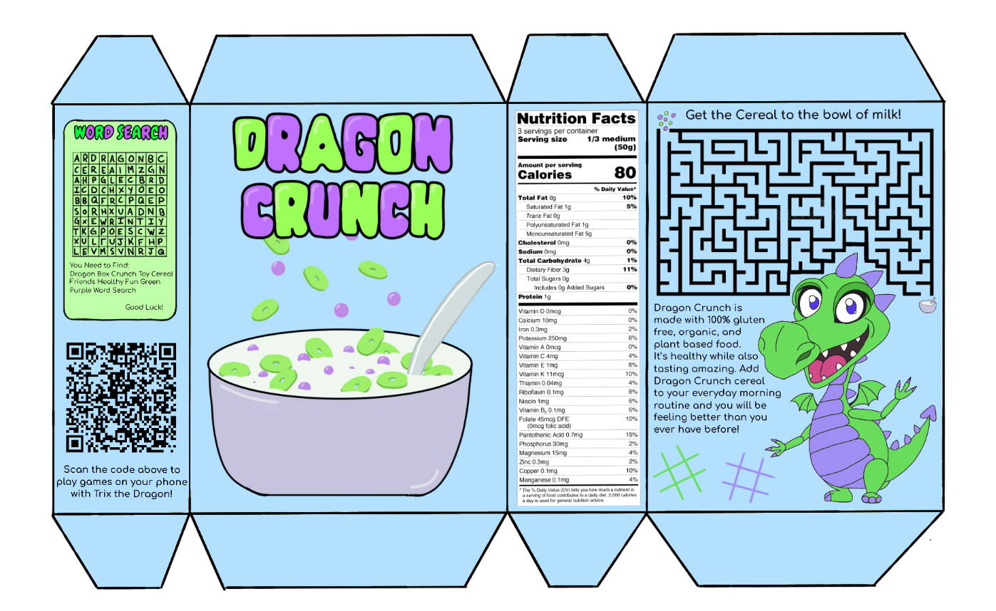
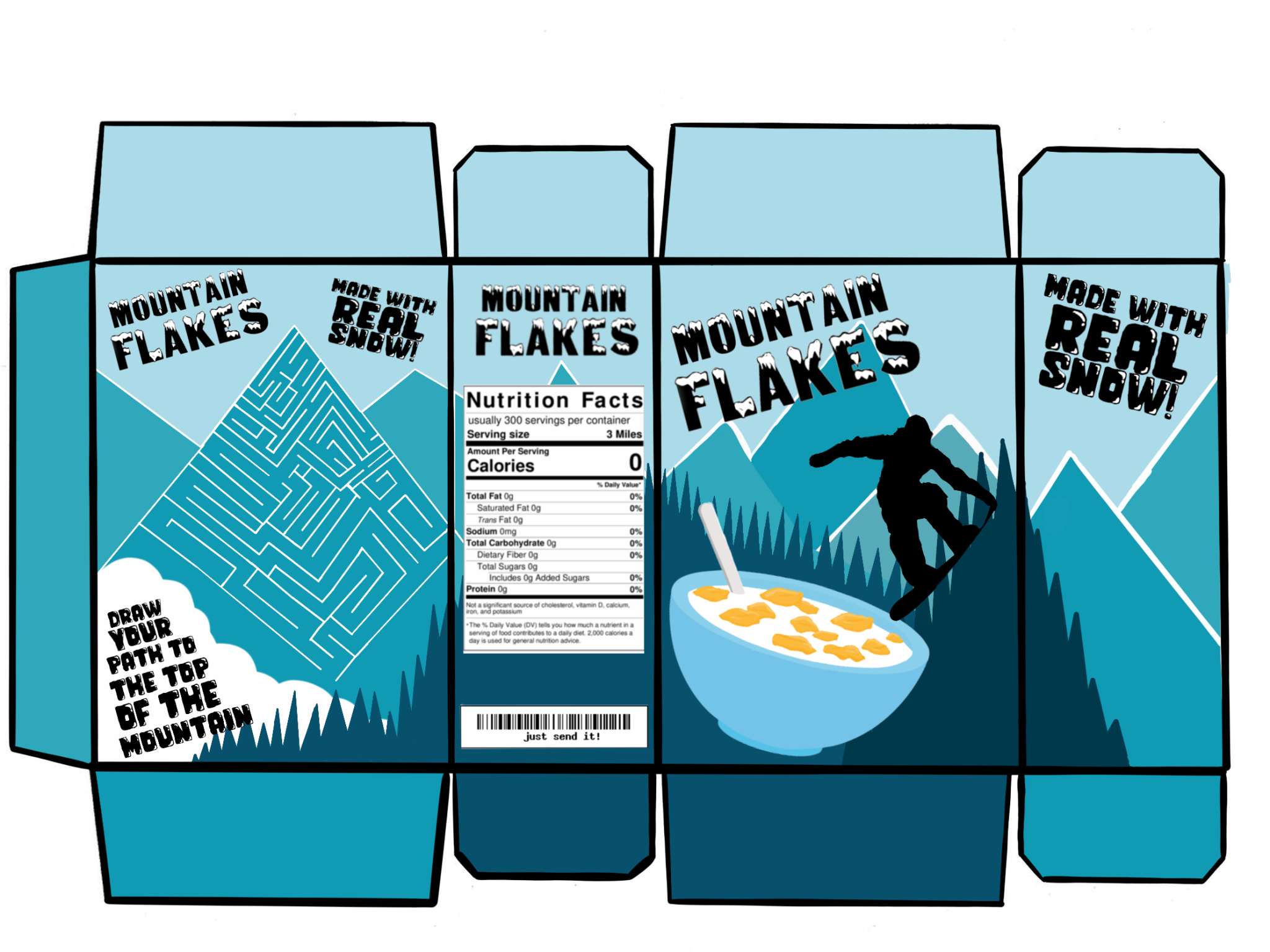
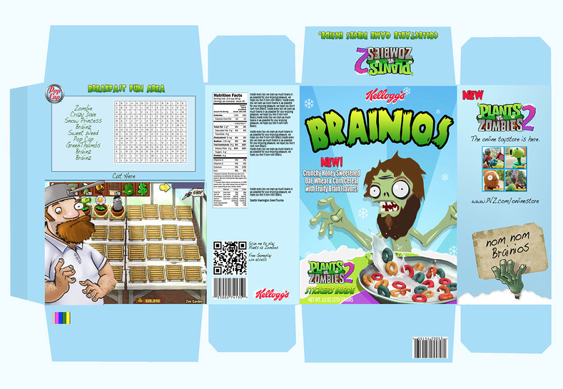
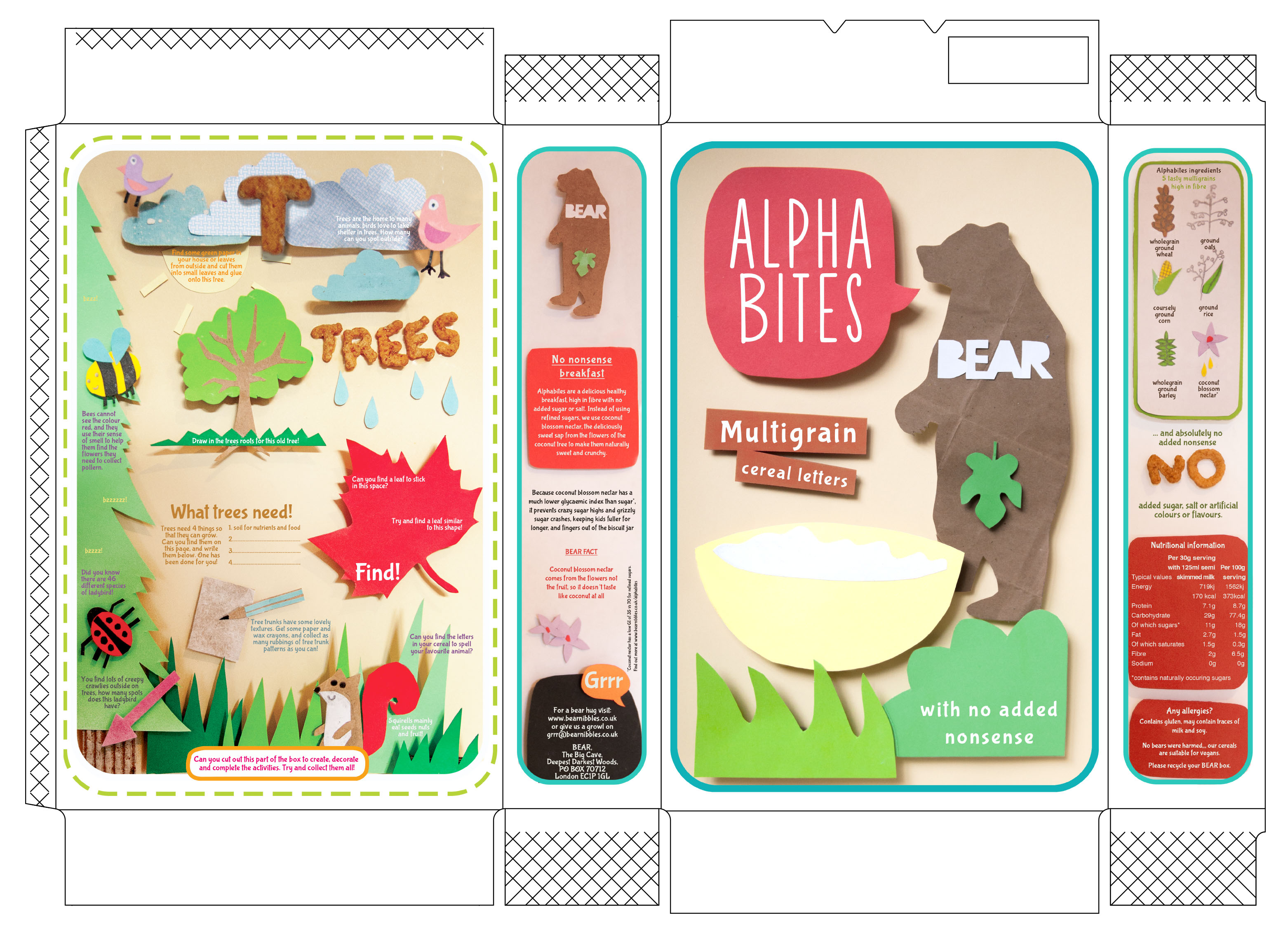
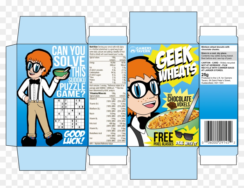
Today’s essential question:How can I use the principles of graphic design to design an attractive cereal box with at least 4 sides that display unity?
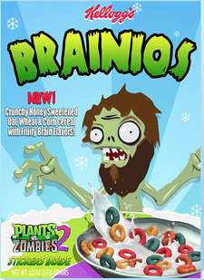
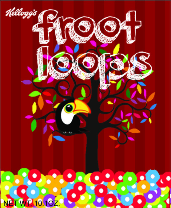
For our next (and last) project this year, we will create a 4 paneled cereal box. Here are some examples that would receive an A:
Project Requirements:
Created in Photopea using provided cereal box template
The box template must include a solid or gradient fill layer as a background
Shows understanding of typography (cereal name is largest and in a fun or decorative typeface, majority of info is in a more legible/boring typeface), chosen typefaces match the style of the graphics and the vibe you are trying to create
Design shows an understanding of visual hierarchy (most important items are the largest and contrast with the rest of the design)