Today’s essential question: How can I use typography to create a professional looking cereal box?
Here are some tips on how to combine typefaces to achieve professional results:
Limit yourself to two fonts – one decorative and one plain/legible (easy to read).
The decorative font should be used for titles and headings, and the plain font should be used for the body/large areas of text.
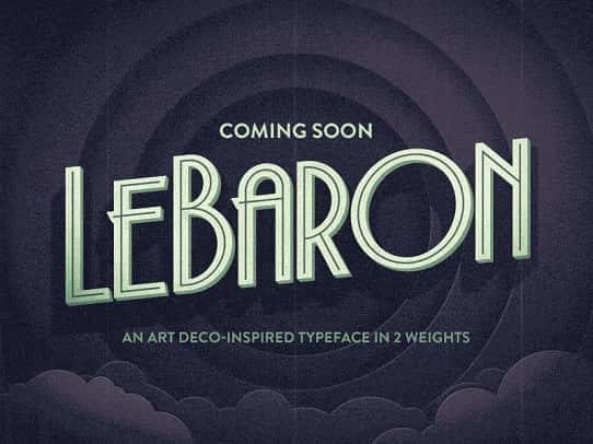
As a general rule, you should use two different typefaces to keep things interesting yet unified. These typefaces should be fairly different to show contrast. Use the decorative/fun font for titles and headlines, and the more legible plain font for the body/large areas of text.
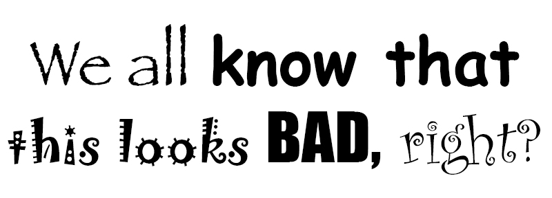
Too many fonts can distract and confuse your audience, like in the example below:
NEVER set body text in a decorative typeface – it will make it illegible and look unprofessional. The image below explains why::

Create Contrast
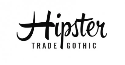
Using contrasting typefaces makes it clear which text are headings and subheads and which are body copy. The differences help create distinct roles for each font, allowing them to stand out as individual pieces of information. Remember to use the decorative/fun font for titles and headlines, and the more legible plain font for the body/large areas of text.
Avoid combining fonts that are too similar
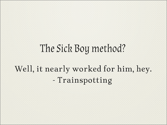
Conflicts between fonts happen when the fonts look too similar. As you can see in the example above, the two fonts share the same weight, size and decoration. As a result they’ve become too alike. They’re performing very similar roles, but the small differences are conflicting which makes for an awkward overall effect. This makes it difficult to establish a hierarchy, because the fonts aren’t visually distinguishable from each other. In fact, font combinations that are too similar can often times look like a mistake—as if you’d been experimenting with different fonts and had forgotten to clean up after yourself.
Establish visual hierarchy
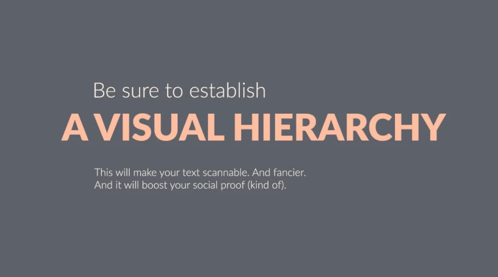
Visual hierarchy tells people where to look first and what is most important. It can be achieved with size, weight, color, texture, orientation and space, or any combination of these tools. Generally, the viewer will first look at whatever is the largest, boldest, or brightest. Visual hierarchy is a great way to add visual interest to your design while limiting yourself to two typefaces.
Use different weights of the same typeface
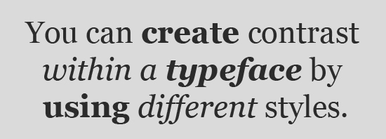
To pair fonts that come from the same family, plan carefully to create contrast, varying things like font size, weight (such as light, regular, and bold), and case (upper, lower, small caps). One of the benefits of limiting your fonts for a presentation to one font family is that it creates a more consistent look. This is another way to keep your design interesting while limiting yourself to two typefaces.