Today’s essential question: How can I use the principles of graphic design to design an attractive cereal box with at least 4 sides that display unity?
For our next (and last) project this year, we will create a 4 paneled cereal box.
Here are some examples that would receive an A:
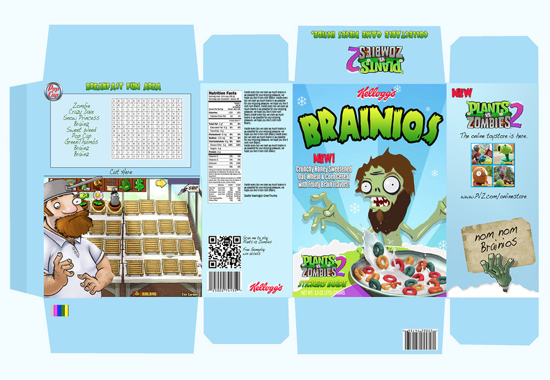
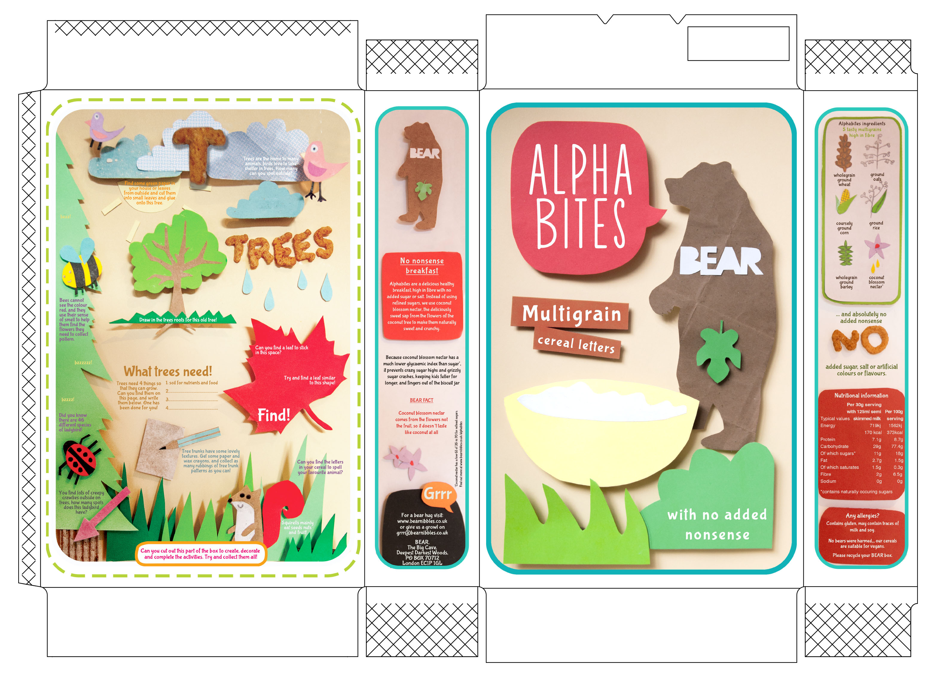
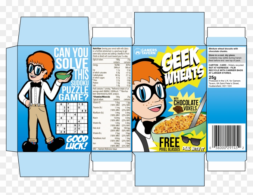

Project Requirements:
- Created in Photopea using provided cereal box template
- The box template must include a solid or gradient fill layer as a background
- Shows understanding of typography (cereal name is largest and in a fun or decorative typeface, majority of info is in a more legible/boring typeface), chosen typefaces match the style of the graphics and the vibe you are trying to create
- Design shows an understanding of visual hierarchy (most important items are the largest and contrast with the rest of the design)
- Design includes the following:
- Cereal name
- Slogan or phrase, example “They’re Great!”
- Free offer: toy or gift
- Nutrition label (can be real or silly/fake)
- UPC Bar code
- Ingredients (can be real or silly/fake)
- Made with/Good source of “you choose”
- Net Weight of cereal in box
